Information Design
Just as the basic tools (if not necessarily the high aesthetics) of visual communication have been thoroughly democratized, tools for data visualization are moving to the mainstream. The most recent example I’ve seen, and it’s a lovely one, is The Gapminder World 2006. The exciting thing to me is not so much that the information design clearly and simply reveals unsettling truths (people in Africa live 30 years shorter lives than people in the US; think about that for a moment) but that the tool makes play out of the work of visualizing the ubiquitously invisible patterns of the world. Along with such as Stamen’s Trulia Hindsight and others, these tools are not only leaving the academy and the messy basement desks of government analysts and moving out into the world, but they are becoming more playful, more narrative, and more polemical. Let the spime wrangling commence (can people be Spimes?).
I’ve been meaning to write up my experiences with a couple of mobile phones for a while. I used a Nokia 6682 for a year or so and recently switched over to a Sony k790a.
My experience with the k790 is a great lesson in why product managers and designers continue to fight about whether features or experience should drive product development. I bought the phone primarily because I wanted a phone with a “real” camera and at the time it was (arguably) the best cameraphone out there (3.2 megapixels, auto-focus, xenon flash, etc.). I did lots of research and so on and bought it primarily on a features basis. After using the phone and camera for a few weeks, however, I realized that while the k790 has an amazing camera for a phone, especially for stills, it’s going to be a while before any cameraphone is going to hold a candle to a decent dedicated point-and-shoot camera (e.g. Canon Elph) let alone a digital SLR. So much for features.
So, you’d think I would have been disappointed but in fact I had already grown to love the phone based solely on the software interaction design. It’s among the most impressive pieces of small-device UI design I’ve encountered (and that includes the iPod which is obviously amazing, but has a much, much easier job description). It’s far from perfect, of course, and there are some patently silly things as with all phones (for example, when looking up contacts, you can only search by first name rather than first or last, so typing “JO” gives me “John Zapolski” but not “Oliver Johns”). But, there are so many places where the designers got it right. And, what I mean by getting it right is that they understood the context the phone would be used in, figured out the most likely thing or things that you’d want to do, and then designed the interface to make those things either extremely easy or automatic. I regularly find myself pleasantly surprised by the interface which is rare indeed, as we all know from countless bad experiences. And, as an interaction designer myself, I can tell you that it is incredibly difficult.
It’s the little things like when scrolling vertically through a list of your contacts you can then scroll horizontally through their different contact methods (home phone, work phone, email) and choose the one you want. It (mostly) just feels incredibly fluid.
By contrast, the Nokia suffers from having to support a lumbering, generalized operating system so that I have the option of downloading lunar calendars, golf handicapping systems, and all kinds of other pseudo-useful Symbian applications but at the expense of doing the things that matter with any degree of subtlety.
(Note: This was all written pre-iPhone, which generally out-fluids the Sony.)
Thau pointed out these excellent Data globes. Someone should make a globe-shaped (globular?) display which can display these!
Interestingly, this Tufte outline is all text. (does being a patron mean not having to link?)
I just discovered musicplasma.com yesterday (thanks to boing boing) and after an initial “that’s cool!” and then a bit of annoyance with the navigation model I started wondering if it’s better than (or even as good as) a simple text list like on allmusic:
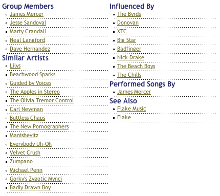
or amazon’s “also bought”:

It is, of course, somehow more fun, but if all I’m trying to do is find new music, I’d think the visualness of the interface would just get in the way (without adding any significant information - Yes, the size of the circles indicates popularity and proximity supposedly indicates strength of relationship, but what do the lines signify? The colors?). Still, I have to admit it’s significantly more fun than a text list. Which makes it another example (along with flickr) of the power of play in product design.

Nice bit of information design on Yahoo maps these days. Traffic conditions and the surprisingly useful ability to find restaurants (and other things) by vicinity:

I’m pretty sure they could have done better than this: 
Line drawings of “subway systems of the world, presented on the same scale”. Gee, my hometown BART system sure is skimpy. (via)
I’d swear I’ve posted a link to the Turntablist transcription method before, but I can’t find it… and notation systems are way interesting, so I’m posting it again.
Christina’s Widgetopia collects, annotates, and categorizes web UI tools (“article tools”, “ratings”, etc.).