Interface Design
The good people over at Adaptive Path have spent some time imagining a near-future web browser called Aurora. The core concepts—structured data replacing monolithic pages, algorithmic grouping of related items, minimized chrome, screen-sharing, etc—are all fairly familiar (to people working on this stuff), but it’s always good to have someone pull the elements together into a coherent vision. I’m looking forward to the rest of the videos.
One aesthetic complaint, however: compared to its inspiration (Starfire), the Aurora video is conspicuously (and unrealistically) pleasant. The people in Starfire are dealing with problems. Granted, they are overcoming them via technology, but at least the situations are tense to begin with. Here, the people seem not to have any problems (not even the weather!). I guess I prefer a bit more angst in my fake future.
Just as the basic tools (if not necessarily the high aesthetics) of visual communication have been thoroughly democratized, tools for data visualization are moving to the mainstream. The most recent example I’ve seen, and it’s a lovely one, is The Gapminder World 2006. The exciting thing to me is not so much that the information design clearly and simply reveals unsettling truths (people in Africa live 30 years shorter lives than people in the US; think about that for a moment) but that the tool makes play out of the work of visualizing the ubiquitously invisible patterns of the world. Along with such as Stamen’s Trulia Hindsight and others, these tools are not only leaving the academy and the messy basement desks of government analysts and moving out into the world, but they are becoming more playful, more narrative, and more polemical. Let the spime wrangling commence (can people be Spimes?).
Here’s an excellent post-iPhone announcement overview and history of multi-touch systems by Bill Buxton of (gulp) Microsoft who has been working on this stuff for a while (like 20+ years).
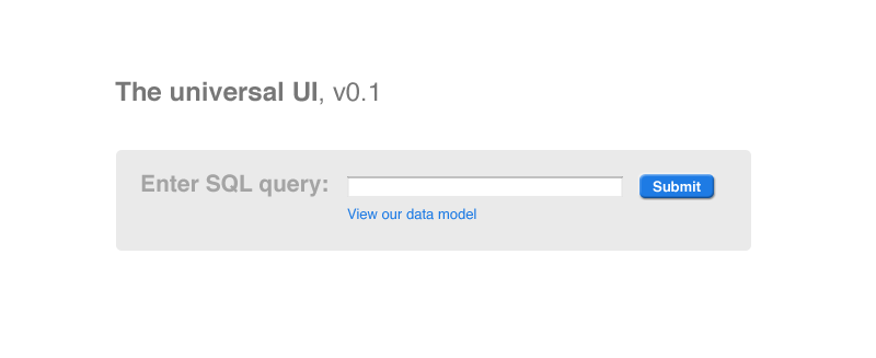
Stop wasting your time doing customer research, figuring out what users really want to do with your application, and fretting about requirements. Giant Ant has solved the interface problem once and for all. Our trademarked “Universal UI (v0.1)” will work for any application, no matter what tasks your users might actually want to do. Problem. Solution. Best of all, we’re releasing it for FREE.
Wow, what can’t Google do better than everyone else? Just took a look at Google calendar, their latest perpetual-beta offering. What’s so impressive to me, as I was discussing with one of Giant Ant’s clients, is not what they are able to make a web app do technically, but what they choose to make it do. The apps are behavior-changing. The calendar’s “Quick add” feature, for example, lets you add events by typing in simple english (e.g. “Meet Wendy for coffee at Farley’s next tuesday at 9am”). This is not a brand new idea (in fact, we designed something similar for a financial services client a few years back), and I’m sure other calendar-designers have thought of doing this, but Google had the hubris and ability to make it work and work beautifully. Other niceties include smooth drag and drop and resizing of events, keyboard shortcurts (Day, Week, Today, etc.), and the ability to share calendars (including editing, something Apple’s mediocre iCal can’t handle).
Come to think of it, the emergence of the GoogleOS is maybe most encouraging to me, as a Mac user, because it frees me from having to rely on Apple’s often stunted offerings like iCal.
Your bad database design is not my interface problem
The Command Line - The Best Newbie Interface? describes one computer instructor’s experience teaching a group of people completely new to computers a Command Line UI. The author suggests the preferability of the CLI to the GUIs we’re all used to and I think it’s an interesting thing to point out, though limited. It made me think of the way domestic life has been changed by “labor-saving” technologies like the vacuum cleaner and dishwasher: The promise was that your work would get easier, but what really happened is that you could get more done. The command line is straightforward (you do one thing at a time, there’s only one point of interaction, etc.), but to do anything comparably complex to, say, retouching a photo would be near impossible. So, don’t start pining for the “good old days” of the VAX just yet.
Here are the slides from Amy Jo Kim’s Etech talk about applying video game mechanics to functional application design: Putting the Fun in Functional. You’ll find yourself nodding along as if you already knew it all, but it’s well worth a read because she does such a nice job pulling it all together into a well-illustrated, coherent narrative.
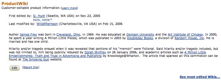
Amazon now has what they’re calling a “product wiki” on each product page. It’s basically a single user-editable chunk of the page. It’ll be interesting to see how this plays out.
I assume this’ll be old news in a few minutes, but Yahoo recently released and open-sourced their previously-internal set of UI design patterns and JavaScript widget library, as well as a companion blog:
Yahoo! User Interface Blog
(with a nice live search bar)
Yahoo! Design Pattern Library
Yahoo! User Interface Library
Congratulations, Nate!