Is Music Plasma All That?
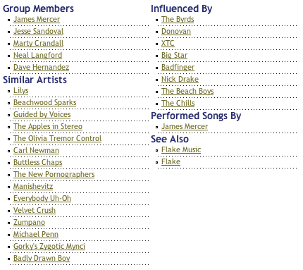
January 7, 2005: I just discovered musicplasma.com yesterday (thanks to boing boing) and after an initial "that's cool!" and then a bit of annoyance with the navigation model I started wondering if it's better than (or even as good as) a simple text list like on allmusic:
or amazon's "also bought":

It is, of course, somehow more fun, but if all I'm trying to do is find new music, I'd think the visualness of the interface would just get in the way (without adding any significant information - Yes, the size of the circles indicates popularity and proximity supposedly indicates strength of relationship, but what do the lines signify? The colors?). Still, I have to admit it's significantly more fun than a text list. Which makes it another example (along with flickr) of the power of play in product design.
