Design
It’s been said that Google doesn’t get ‘social’ and, though I think that is vastly overstated, there is truth there. Similarly, I’d say that Apple doesn’t understand the internet. Well I have a simple theory about it. There’s a cliché that everyone’s greatest strength is also their greatest weakness, and I believe that applies as well to organizations as to people.
Take Apple. They make amazing, holistic products and services and one of their primary tools is control. Fanatical, centralized control. Control over the design, over the hardware, over the experience. And that’s exactly the opposite of the internet, which is about decentralization and messy, unfiltered chaos.
Google, on the other hand, gets the internet, but has trouble with humans. And I’d say it’s not so much because it’s an engineering-heavy organization or that Google doesn’t know how to have fun (both reasons I’ve seen stated publicly). I think it’s that one of Google’s biggest strengths is in search, which is largely about things like precision and recall, about stitching the chaos of the internet into some semblance of order. But social interactions happen in the variance, in the messy spaces that seem meaningless. Much social meaning is carried by phatic communication and that is exactly opposite to what Google does, which is to optimize signal vs. noise, looking for the meaning and discarding the meaningless.
Presumably, we can find the undoing of other organizations in their strengths. What, for example, is Microsoft really, really good at? Or Facebook?
I’ve been noticing how Apple’s Macbooks wear out in such a way that they feel old and broken, that they announce they are ready to be replaced rather than repaired (or simply enjoyed like an old hammer or a copper bartop that’s developed an inviting patina with use).
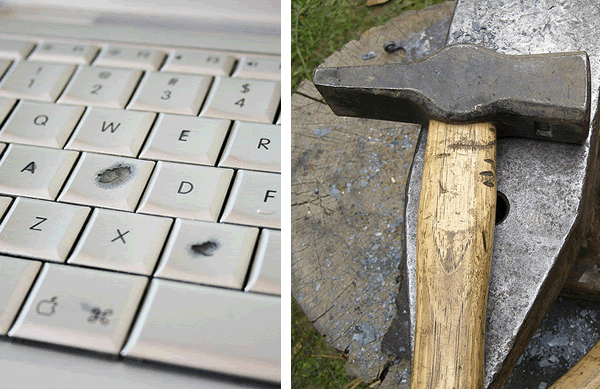
Photos: flickr.com/gubatron (Macbook), flickr.com/erix (hammer)
At Apple, this quality extends to the visual design, which uncannily becomes dated the very instant the next version is unveiled. I don’t know how they manage to do this over and over again, to appear timeless and classic at one moment and laughably dated the next. Planned obsolescence seems to be part of the design strategy at Apple.
But I’m more interested in the physical component of this than the visual, the way the materials chosen or assembled ensure premature failure rather than longevity. And I can’t help wondering if it’s intentional, if someone has made a deliberate decision to use materials that will wear out rather than wearing in.
I’ve been trying to think of what to call this. It’s related to planned obsolescence, but that seems to refer more the capabilities of the thing or, as I’ve used it above, to its appearance, not to its integrity as a thing. No, this is at once more subtle a strategy and more stark. Something like designed failure.
Of course, like most tools of design, designed failure can be used for good as well as for bad. A simple, but clever, example, is the way a tiny slit in an otherwise all but unopenable package, when folded over becomes the start of a tear. I love designs like this where simple physics are used to such effect and few instructions are necessary because we are all vernacular physicists.
And I was just alerted to another example of designed failure by the twitterverse: the K1 Auto-disable syringe which, to prevent infections from shared syringes, can only be used once. According to the marketing copy:
A small ring etched on the inside of the barrel allows the specially-adapted plunger to move in one direction and not the other. After one complete injection is given the plunger will automatically lock in place, and break if forced, rendering the syringe useless.
So, two questions to ponder: If you are making something that should last, are you designing for resilience and repair? And, if not, can you design failure that supports the needs of your users?
Alex Wright gave a talk based on his book down at Google and it’s probably the longest video I’ve ever watched with full attention start to finish on the web. The Web That Wasn’t is an accessible and inspiring series of biographical sketches of historical visionaries of the web and web-like constructions. Alex describes the visions and significance of Paul Otlet, Vannevar Bush, Douglas Engelbart, Ted Nelson, and others who foresaw the current www (and more) over the past 100+ years. And, in so doing, he points out the ways the current web falls short of their various visions as well as describing the gestures in the current incarnation towards such things as two-way links, and visible trails through hypertext. Well done, Alex.
Matt’s closing keynote at reboot, Products Are People Too is easily my favorite idea bomb of the past 5 years. See also: Clifford Nass and, more disturbingly, this McLuhan quote:
…man in the normal use of technology…is perpetually modified by it and in turn finds ever new ways of modifying his technology. Man becomes, as it were, the sex organs of the machine world, as the bee of the plant world, enabling it to fecundate and to evolve ever new forms. The machine world reciprocates man’s love by expediting his wishes and desires….
Envelope and Letterfolding Techniques: “One of the “Holy Grails” of envelope and letter folding is to create a fold which not only latches, but can’t be unfolded—sealing it shut like a glued envelope. No one seems to have managed this feat, so far.” (via)
The Design Encyclopedia is the latest from Under Consideration. Think of it as Wikipedia for design with all the decentralized content-creation and hypertextual non-hierarchy that that implies. Still in Beta and obviously missing lots of obvious entries, this looks to be a great resource for anyone interested in design, though it will be interesting to see how TDC differentiates itself from Wikipedia (see, for example, the two sites’ entries for BIC: TDC, Wikipedia)
These Marcel Wanders components are a welcome ornate antidote to the relentless flaccid placid futurism of the Apple ID group. And the TV/microwave is a lovely bit of design art: now you can watch TV while you wait for your TV dinner to cook (so you can eat while you watch TV). Brilliant.
I think this Frog Design article on “dissonant designs” is pure hokum. People buy Bugaboo strollers for the same two reasons people buy any luxury item: one, they’re nicer than the average stroller (as in they feel good to push around… you know, that user experience thing all the kids are talking about); and two, they’re a status symbol. That’s it.
Oh, and, this bit on the Escalade is just patronizing hogwash:
Urban hip-hoppers now drive Cadillac Escalades because of the ironic twist they create by juxtaposing their cutting-edge culture with Cadillac’s stodgy, older brand image. Because the brand was not originally intended for them, driving Escalades enables them to poke fun at the brand’s old expectations. With the adoption of the Escalade as an urban icon, Cadillac’s brand has been rejuvenated after several decades of declining relevance.My guess is that “Urban hip-hoppers” (if you mean “black people” just say it) drive Escalades not because they’re ironic but precisely because they’re the classic American status symbol car. And they’ve been marketed at young urbanites from day one. Sorry to get so snippy, but this one got under my skin.
thoughtlessacts.com includes images from the book as well as letting visitors contribute their own photos.
“Groceteria.com is a site about supermarket history and architecture, roughly covering the period from the 1920s to the 1970s.”