I took a hike the other day. It was a perfect Marin morning, blue skies and just hot enough to work up a sweat. I had no signal so I left my phone in the car to save weight. Of course, as soon as I got a few hundred feet up the trail I wished I had it with me so I could take a pic to share later. Then something unusual happened: I asked myself why I wanted to do that.

It’s been said that Google doesn’t get ‘social’ and, though I think that is vastly overstated, there is truth there. Similarly, I’d say that Apple doesn’t understand the internet. Well I have a simple theory about it. There’s a cliché that everyone’s greatest strength is also their greatest weakness, and I believe that applies as well to organizations as to people.
Take Apple. They make amazing, holistic products and services and one of their primary tools is control. Fanatical, centralized control. Control over the design, over the hardware, over the experience. And that’s exactly the opposite of the internet, which is about decentralization and messy, unfiltered chaos.
Google, on the other hand, gets the internet, but has trouble with humans. And I’d say it’s not so much because it’s an engineering-heavy organization or that Google doesn’t know how to have fun (both reasons I’ve seen stated publicly). I think it’s that one of Google’s biggest strengths is in search, which is largely about things like precision and recall, about stitching the chaos of the internet into some semblance of order. But social interactions happen in the variance, in the messy spaces that seem meaningless. Much social meaning is carried by phatic communication and that is exactly opposite to what Google does, which is to optimize signal vs. noise, looking for the meaning and discarding the meaningless.
Presumably, we can find the undoing of other organizations in their strengths. What, for example, is Microsoft really, really good at? Or Facebook?
I’ve been noticing how Apple’s Macbooks wear out in such a way that they feel old and broken, that they announce they are ready to be replaced rather than repaired (or simply enjoyed like an old hammer or a copper bartop that’s developed an inviting patina with use).
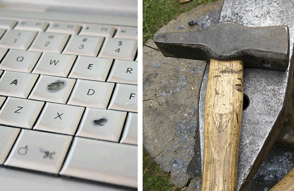
Photos: flickr.com/gubatron (Macbook), flickr.com/erix (hammer)
At Apple, this quality extends to the visual design, which uncannily becomes dated the very instant the next version is unveiled. I don’t know how they manage to do this over and over again, to appear timeless and classic at one moment and laughably dated the next. Planned obsolescence seems to be part of the design strategy at Apple.
But I’m more interested in the physical component of this than the visual, the way the materials chosen or assembled ensure premature failure rather than longevity. And I can’t help wondering if it’s intentional, if someone has made a deliberate decision to use materials that will wear out rather than wearing in.
I’ve been trying to think of what to call this. It’s related to planned obsolescence, but that seems to refer more the capabilities of the thing or, as I’ve used it above, to its appearance, not to its integrity as a thing. No, this is at once more subtle a strategy and more stark. Something like designed failure.
Of course, like most tools of design, designed failure can be used for good as well as for bad. A simple, but clever, example, is the way a tiny slit in an otherwise all but unopenable package, when folded over becomes the start of a tear. I love designs like this where simple physics are used to such effect and few instructions are necessary because we are all vernacular physicists.
And I was just alerted to another example of designed failure by the twitterverse: the K1 Auto-disable syringe which, to prevent infections from shared syringes, can only be used once. According to the marketing copy:
A small ring etched on the inside of the barrel allows the specially-adapted plunger to move in one direction and not the other. After one complete injection is given the plunger will automatically lock in place, and break if forced, rendering the syringe useless.
So, two questions to ponder: If you are making something that should last, are you designing for resilience and repair? And, if not, can you design failure that supports the needs of your users?
 Just had an interesting interaction. A colleague, while watching a talk, posted to twitter from her phone (I assume) that she wanted to find a document by the speaker. I was at my laptop and went and found it and replied with the URL. The interesting thing here from a mobile design perspective is the idea that the network optimized this task of finding the resource. It would have been difficult for her to do on her phone but it was trivial for me. I don’t know what to call this: micro-lazyweb or “responsibility shifting” or something. Oh, the link: Jan Chipchase - Future Perfect: (Nokia) Open Studios
outside.in, part of the bevy of emerging geo services (i.e. we know geo is big, but aren’t sure what to do with it), surfaces “news” based on your current location. You can see what’s going on within 1000 feet of you, in your neighborhood, or in your city. So far so good, but it turns out that most of what’s going on right around me is less relevant than a lot of what is happening elsewhere (e.g. I don’t care that a random person is telling another random person via twitter that they are at my local pizza joint).
This is all about the fact that while location is a very salient factor in my experience right now, it is much less important when compared with my social network. In other words, I (generally) care more what my wife is doing even if she’s halfway around the world from me than what a stranger is doing at the bus stop across the street (unless what they’re doing is particularly interesting ;)
This leads me to a thought: the farther away an information source is from me in relevance, the more likely I want that information in aggregate. So, I may not care that random person A is at Goat Hill Pizza, but knowing that 60 people think Goat Hill has great garlic bread has some value. There’s a diagram in there somewhere, but no time to draw right now.
The good people over at Adaptive Path have spent some time imagining a near-future web browser called Aurora. The core concepts—structured data replacing monolithic pages, algorithmic grouping of related items, minimized chrome, screen-sharing, etc—are all fairly familiar (to people working on this stuff), but it’s always good to have someone pull the elements together into a coherent vision. I’m looking forward to the rest of the videos.
One aesthetic complaint, however: compared to its inspiration (Starfire), the Aurora video is conspicuously (and unrealistically) pleasant. The people in Starfire are dealing with problems. Granted, they are overcoming them via technology, but at least the situations are tense to begin with. Here, the people seem not to have any problems (not even the weather!). I guess I prefer a bit more angst in my fake future.
Muji Chronotebook is a new dayplanner that uses an analog “clock” metaphor, with each page arranged around a circular center. The left page is AM and the right page is PM.

So, my first reaction was really positive. We desperately need more design that grounds our daily experience in the physical, and this appears to be beautifully expressive of circadian rhythms and the subjective experience of time, but…
… is it really so natural? Looking at the layout, I feel pretty uncomfortable. Sure, our experience of a sequence of days is cyclical, but I think our experience of the flow of a single day is much more linear.
I also wonder about writing around a circle. Maybe this works better for character-based languages, but it seems awkward for, say, english.
(Please note that I haven’t actually used the thing. Maybe it’s awesome ;)
When the blackbird flew out of sight,
It marked the edge
Of one of many circles.
from Wallace Stevens, Thirteen Ways of Looking at a Blackbird
Alex Wright gave a talk based on his book down at Google and it’s probably the longest video I’ve ever watched with full attention start to finish on the web. The Web That Wasn’t is an accessible and inspiring series of biographical sketches of historical visionaries of the web and web-like constructions. Alex describes the visions and significance of Paul Otlet, Vannevar Bush, Douglas Engelbart, Ted Nelson, and others who foresaw the current www (and more) over the past 100+ years. And, in so doing, he points out the ways the current web falls short of their various visions as well as describing the gestures in the current incarnation towards such things as two-way links, and visible trails through hypertext. Well done, Alex.
Just as the basic tools (if not necessarily the high aesthetics) of visual communication have been thoroughly democratized, tools for data visualization are moving to the mainstream. The most recent example I’ve seen, and it’s a lovely one, is The Gapminder World 2006. The exciting thing to me is not so much that the information design clearly and simply reveals unsettling truths (people in Africa live 30 years shorter lives than people in the US; think about that for a moment) but that the tool makes play out of the work of visualizing the ubiquitously invisible patterns of the world. Along with such as Stamen’s Trulia Hindsight and others, these tools are not only leaving the academy and the messy basement desks of government analysts and moving out into the world, but they are becoming more playful, more narrative, and more polemical. Let the spime wrangling commence (can people be Spimes?).
Lots of change around here. I have a new job and Giant Ant has a new site. As part of this transition, I’ve moved my personal weblog to a new domain (/). I’ve gone and set up some mod_rewrite rules (thank you Apache!) to redirect old Antenna posts seamlessly, but I’m sure lots of stuff will fall through the cracks. Please bear with me and if you see something messed up or missing, I’d appreciate a quick email letting me know. Thanks!
I’ve been meaning to write up my experiences with a couple of mobile phones for a while. I used a Nokia 6682 for a year or so and recently switched over to a Sony k790a.
My experience with the k790 is a great lesson in why product managers and designers continue to fight about whether features or experience should drive product development. I bought the phone primarily because I wanted a phone with a “real” camera and at the time it was (arguably) the best cameraphone out there (3.2 megapixels, auto-focus, xenon flash, etc.). I did lots of research and so on and bought it primarily on a features basis. After using the phone and camera for a few weeks, however, I realized that while the k790 has an amazing camera for a phone, especially for stills, it’s going to be a while before any cameraphone is going to hold a candle to a decent dedicated point-and-shoot camera (e.g. Canon Elph) let alone a digital SLR. So much for features.
So, you’d think I would have been disappointed but in fact I had already grown to love the phone based solely on the software interaction design. It’s among the most impressive pieces of small-device UI design I’ve encountered (and that includes the iPod which is obviously amazing, but has a much, much easier job description). It’s far from perfect, of course, and there are some patently silly things as with all phones (for example, when looking up contacts, you can only search by first name rather than first or last, so typing “JO” gives me “John Zapolski” but not “Oliver Johns”). But, there are so many places where the designers got it right. And, what I mean by getting it right is that they understood the context the phone would be used in, figured out the most likely thing or things that you’d want to do, and then designed the interface to make those things either extremely easy or automatic. I regularly find myself pleasantly surprised by the interface which is rare indeed, as we all know from countless bad experiences. And, as an interaction designer myself, I can tell you that it is incredibly difficult.
It’s the little things like when scrolling vertically through a list of your contacts you can then scroll horizontally through their different contact methods (home phone, work phone, email) and choose the one you want. It (mostly) just feels incredibly fluid.
By contrast, the Nokia suffers from having to support a lumbering, generalized operating system so that I have the option of downloading lunar calendars, golf handicapping systems, and all kinds of other pseudo-useful Symbian applications but at the expense of doing the things that matter with any degree of subtlety.
(Note: This was all written pre-iPhone, which generally out-fluids the Sony.)
I heart culture jamming: Sniggle Net has lots of good stuff, including a bit on one of my favorite culture hacks ever, the Barbie Liberation Organization (BLO).