Apple doesn't get keywords
February 3, 2005: I recently installed iPhoto 5, and wow I can't tell you how much Apple does not get keywords. This is the third completely different interface they've tried for tagging photos and they are all completely lame. First came this:

Which was cumbersome and semi-useless as we'll see in a moment. Then, in iPhoto 4, they created this multi-modal abomination:

Which was so bad that people went and modified the code to make it at least suck a little less.
Now, they've gone partway back to the original (using rigid tiles for each keyword):
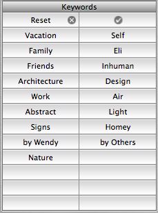
Which would be bad enough because it won't scale past about 20 tags, but it's made so much worse by the fact that in order to edit the tags for a given photo you have to select the photo, then choose Get Info, then choose the Keywords tab and then check the boxes for the tags you want to add:

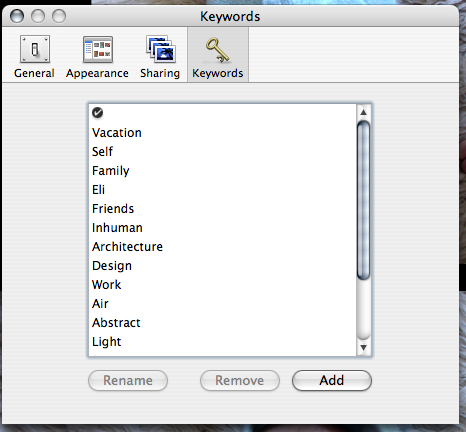
What's that? You want to add a new tag? Well, of course, you simply go to the iPhoto Preferences and select the Keywords pane and use a third (!) totally distinct UI there:
Feh! Compare to, say, Flickr, where you simply click on "Add" next to the list of keywords for the current photo:


Now, I have a few gripes with the flickr tags UI, but next to iPhoto it's the most natural, transparent mechanism in the world. But this is only interesting because it reveals a huge difference in the way that Apple and flickr's respective designers seem to envision people using tags. The Apple model assumes several broad categories (the defaults are things like "Family" and "Vacation") while flickr assumes actual descriptive metadata (like "red" and "insect" and "banal"). Which makes flickr's tags useful and interesting and Apple's not.
ps - I have more to say about tags, but I'll save that for a later post.